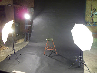
I thought it may be beneficial for some of you to see how I actually set up to take the pictures for my Website. All you need are three lights, a backdrop, a camera and tripod.
The first light is called the key light, it rakes across the piece at about a 45 degree angle to the camera and sets closest to the piece. The next is called a fill light, it rakes across on the opposite side again at a 45 degree angle. So it doesn't overpower the key light, it gets moved back and forms a wider light cast. The last light is called the back light. It does just what it states, it lights from the back, (notice it's just a cheap clip on light stuck on a dolly).
This is pretty easy to do and you can do it all with cheap incandescent clamp on lights. If you want to learn more, YouTube has several videos on the subject and they make pretty good sense. That's where I went to learn a bit more.
 |
| Notice the shadow |
 |
| Shadow is gone |
Now once the lights look good to you, start snapping photos without the flash on and check each picture to see if it's appealing to your eye. If you see hard shadows adjust the lights till it's gone or in a little less visual position. It takes some finagling but it's not difficult. You just need a bit of patience, and you can get really pretty decent photos for next to nothing, maybe $200 or so. Once you get it set up, you can do all your own pictures, whether for a website or to send in to a magazine for awards, contests, articles etc. I have had a few pieces in a couple different home magazines and all but one I took myself.
Magazines usually don't want any distraction material such a teddy bear in a chair or just a piece placed next to a wall where trim and wall paint pull the eye away from the piece. That's why a back drop works great. All your focus is on the piece your photographing and not the distributive elements. Plus it looks so mush more professional without distractions. Your pictures will take on a higher quality and be more visually stimulating to potential customers, a plus if you are trying to sell your wares.
While this picture isn't horrible, it's still has too many distractions. The light socket for one thing, but the contrast from the wall color and the trim plus the floor, are very eye catching and takes the viewers focus from the actual piece your trying to draw attention to.
This has better visual focus and keeps the eye looking at the chair instead of a disruptive background.


I can appreciate this post as I've been working to photograph my wood turnings.
ReplyDeleteA somewhat similar process is involved except that I ended up using a light tent or doing it outdoors.
I thought I was pretty good for a rank amateur photographer, but I really, really struggled with this one.
I'm still working on the light tent thing, but getting close to what I want. The focal length, glossy finish, light angles, shadows, manual focus, and light color all make for a very difficult shoot.
On the bright side, as with your setup, when I get a setup I like, I will be able to use it for just about everything. And that makes it worthwhile.
As with your setup, I won't have much invested either.